Archived article
Please note that tax, investment, pension and ISA rules can change and the information and any views contained in this article may now be inaccurate.
 magazine
What is the yield curve telling investors?

No investment indicator is infallible – if it were, none of us would be working and all of us would be playing the markets (only to find, ultimately, that there would be nothing in which for us to invest except each other’s investments).
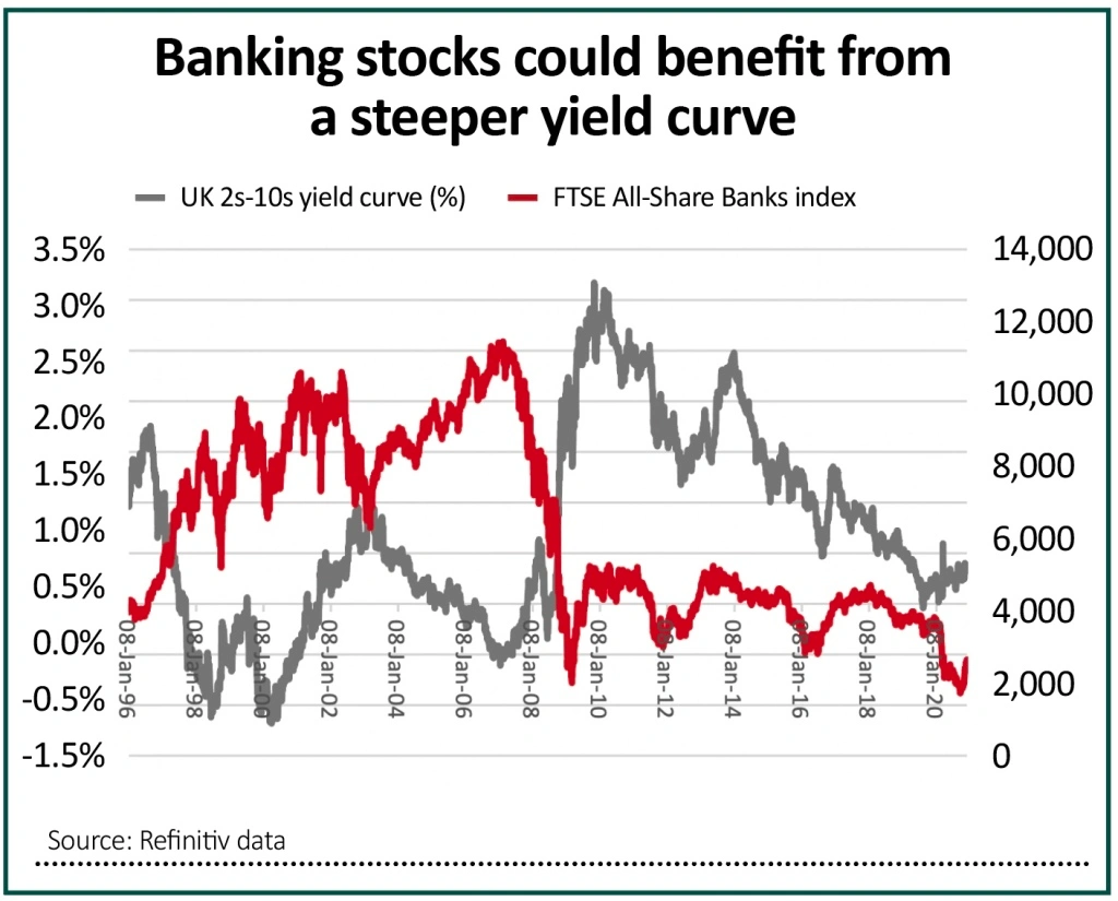
However, one which is generally held to stand the test of time is the yield curve. Investors may be intrigued to learn that the curve in the UK stands at its steepest since August 2019, while in the US the yield premium offered by 10-year US Treasuries relative to two-year paper is at its highest since October 2017.
In theory, this is bond markets’ way of saying that an economic upturn and possibly inflation are coming. This is a view which has considerable implications for financial markets and asset allocation strategies overall, as well as fund and specific stock selection strategies.
UNDERSTANDING YIELD CURVES
In general terms, there are four types of yield curve, using the difference in yield between two and 10-year government bonds as a benchmark.
• Normal. Here yield on the 10-year paper is higher than that of the two-year. Investors demand compensation for the additional eight years to maturity, as this means there is more time for things to go wrong. Inflation, interest rate increases and default are the main three dangers.

• Steep. In this case, long-term yields rise more quickly than near-term ones as investors look to price in an acceleration in economic growth and interest rate increases. Investors fear being locked into low rates and demand greater compensation for owning longer-dated paper.
• Flat. This is where the bond market is unsure how to proceed. Yields on two and 10-year paper are the same as the economy transitions from downturn to upturn, or upturn to downturn.
• Inverted. Here, bond markets fear an economic slowdown or recession and the yield on longer-dated bonds drops below that of shorter-term paper. This happens because investors price in future interest rate cuts in response to the slowdown and a drop in coupons on bonds issued by governments in the future.
Twelve to 18 months ago the talk was of how yield curves were inverting and how that could have been warning of trouble ahead (though no-one would pretend that fixed-income markets saw the pandemic or subsequent recession coming).
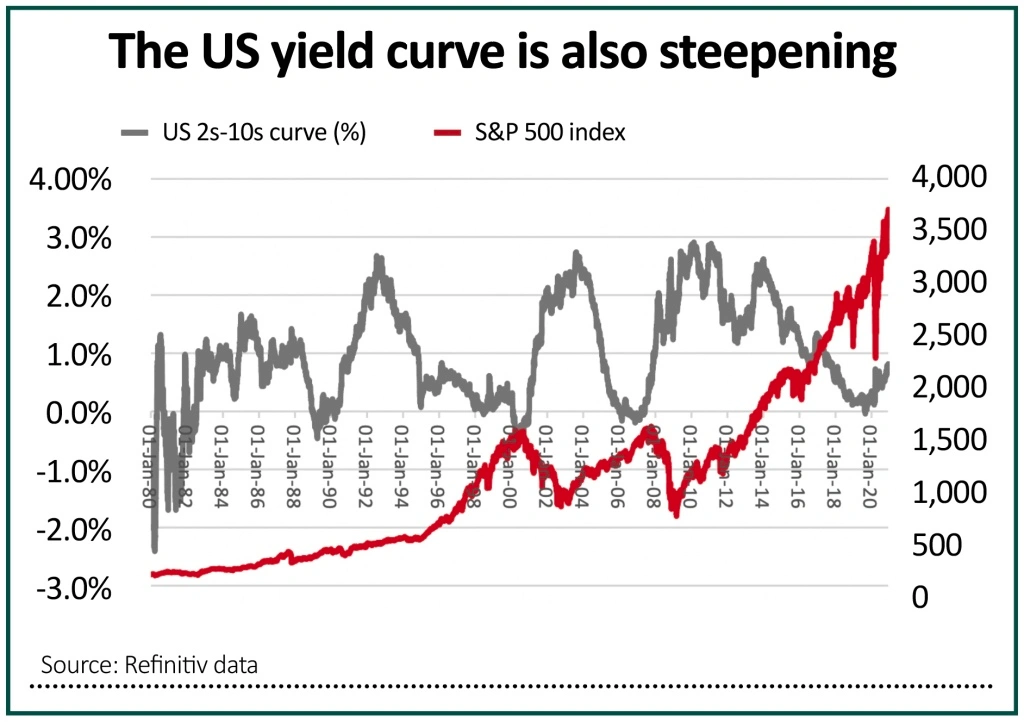
The picture is quite different now. Buoyed by further momentum the race for a Covid-19 vaccine and further fiscal stimulus from Congress, combined with further monetary largesse from the US Federal Reserve, the yield curve is now steepening in the US, a trend which characterised the early stages of the bull equity markets that began in 1982, 1990, 2002 and 2009.
Admittedly, Japan’s experiences since 1990 suggest the yield curve can be a poor predictor of economic activity but the yield curve has had its uses in the UK.
Inverted yield curves in 2000 and 2007 helped to call the top for the FTSE All-Share index but a marked steepening represented the beginning of bull runs in 1998, 2003 and in the early stages of the last decade.
Style council
There may be further implications below the level of headline indices. Banking stocks, for example, have been crushed by central banks’ efforts to keep yields low (and by implication yield curves flat) as they try to help governments fund their burgeoning debts.
A steeper curve could boost banks’ net interest margins, earnings power, share prices and ability to pay dividends. This could be influential in the UK market, for example, where the FTSE 100’s Big Five banks are so integral to earnings and dividend growth forecasts.
Even more intriguingly, a steeper yield curve, hinting as it does of a stronger economy and inflation, seems to favour cyclical earnings growth over secular earnings growth – or, to put it more crudely, ‘value’ as a style over ‘growth’ – at least if history is any guide.
As this column has noted (Shares, 29 Oct 2020), value has tried to forge a recovery relative to growth, using the ratio of the price of the Invesco QQQ Trust, an exchange-traded fund (ETF) designed to track and deliver the performance of the heavyweight NASDAQ 100 index (minus its running costs), relative to the iShares Russell 2000 Value ETF, as a benchmark.
Some are wondering if this trade is already exhausted. Yet based on what happened in 2000, you could argue that it has hardly begun, such was the violence of the switch from growth to value as the former began to falter under the twin weights of lofty valuations and earnings disappointment.


Important information:
These articles are provided by Shares magazine which is published by AJ Bell Media, a part of AJ Bell. Shares is not written by AJ Bell.
Shares is provided for your general information and use and is not a personal recommendation to invest. It is not intended to be relied upon by you in making or not making any investment decisions. The investments referred to in these articles will not be suitable for all investors. If in doubt please seek appropriate independent financial advice.
Investors acting on the information in these articles do so at their own risk and AJ Bell Media and its staff do not accept liability for losses suffered by investors as a result of their investment decisions.
Issue contents
Exchange-Traded Funds
Feature
First-time Investor
Great Ideas
Money Matters
News
- Supply chain issues could mean a bleak winter for UK consumers
- Big Goco shareholder Peter Wood throws weight behind Future tie-up
- Questions still linger over National Grid and SSE dividends
- Key catalysts for markets before the end of 2020
- Flutter Entertainment secures prize US asset
- Fast growing hydrogen stock Ceres gets closer to fulfilling its potential