Archived article
Please note that tax, investment, pension and ISA rules can change and the information and any views contained in this article may now be inaccurate.
 magazine
An introduction to charting for first timers
Seasoned investors often dismiss technical analysis as having nothing to do with fundamental research, and of course they are right. There is no substitute for doing your own research on a company before buying shares.
However, a picture paints a thousand words, and while share prices are meant to respond to fundamentals, like the outlook for profit and the economic backdrop, emotion can play a large part in how stocks move.
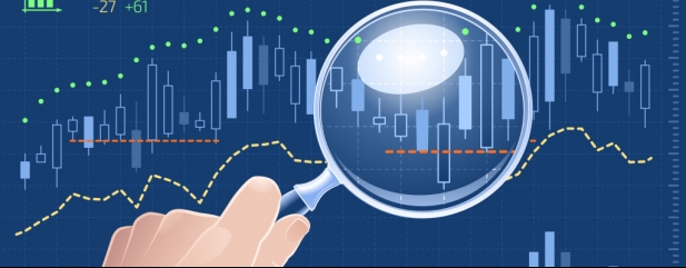
CHARTS TELL A STORY
Charts can help you gain an understanding of investor emotion or sentiment and this is the first of a multi-part series aimed at demystifying technical analysis and the analysis of charts.
To kick things off, we’re going to take a look at one of the most popular style of charts are known as Japanese candlesticks. Believed to have been invented in the 1700s by rice traders, candle sticks don’t just show the closing price for a stock, they also show the opening price and the intra-day high and low, which can tell you a great deal about how a stock traded over the day.
In the first example in our graphic (Japanese Candlesticks), the red body means it was a down day for the stock, with the ‘wick’ at the top representing the intraday high and the ‘shadow’ at the bottom showing the intraday low. Originally up days were white and down days black, as the charts were hand-drawn.
In the second example, the high and low are represented again by the wick and the shadow but as the shares closed up on the day the body is green.
WHERE TO FIND WHAT YOU NEED
To call up a candlestick chart on the Shares website, first choose a stock in the search box. We have picked Direct Line (DLG). Underneath the menu bars and the share price data is an intraday chart, and underneath that is a link to Advanced Charts.
Above the bar showing the date range is the cog-shaped Settings icon with a drop-down menu. Click on Display, under Cursor Type click Off, and under Chart Type click Candlestick.
Clicking anywhere on the chart will close the drop-down menu. We have selected the six-month chart, and immediately it contains more information than a simple line chart.
For starters, there are more red (down) candles than green (up) candles, so sellers have had the upper hand over six months, and there have been some sizeable drops.
However, that trend seems to have changed since mid-July with the shares making three-month highs following the latest earnings report.
LOOKING FOR PATTERNS
Experienced traders will scrutinise these charts to look for signs of reversal patterns such as ‘bullish engulfing’ and ‘bearish engulfing’ candlesticks, or ‘bullish harami’ and ‘bearish harami’.
There are plenty of resources online for novice chartists to start their own journey of discovery and we’ll be looking at other elements of charting in upcoming articles.
What is a reversal pattern?
This is a pattern in the price of investment which shows a shift in the prevailing trend. Meaning that either the bulls (buyers) or bears (sellers) in a market have run out of steam.

Important information:
These articles are provided by Shares magazine which is published by AJ Bell Media, a part of AJ Bell. Shares is not written by AJ Bell.
Shares is provided for your general information and use and is not a personal recommendation to invest. It is not intended to be relied upon by you in making or not making any investment decisions. The investments referred to in these articles will not be suitable for all investors. If in doubt please seek appropriate independent financial advice.
Investors acting on the information in these articles do so at their own risk and AJ Bell Media and its staff do not accept liability for losses suffered by investors as a result of their investment decisions.