Archived article
Please note that tax, investment, pension and ISA rules can change and the information and any views contained in this article may now be inaccurate.
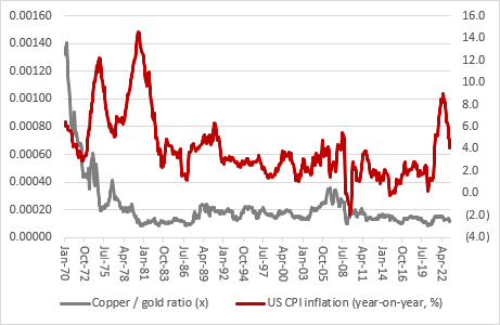
“Many investors swear by copper as a good guide to global economic and financial health – and hence the industrial metal’s nickname of ‘Doctor Copper’ – while others look to gold as a measure of whether there is trouble ahead or not,” says AJ Bell investment director Russ Mould.
“A study of the copper-to-gold ratio could therefore be informative. If copper does better, this may be markets’ way of saying that the good times might be ready to keep rolling. If the precious metal outperforms the industrial one, that could be an indicator that something bad is going to happen – an inflationary outbreak or a recession (or even both at the same time, in the worst of all worlds, and a return to the stagflation of the 1970s).
“Copper is priced in tonnes and gold in ounces, but the conversion is an easy one, as there are 35,270 ounces in a tonne. If the line on the chart rises, then copper prices are doing better than gold and if it falls then the precious metal is outperforming the industrial one.
“Gold massively outperformed copper in the 1970s, after US President Richard Nixon withdrew the dollar from the gold standard, scrapped the fixed exchange rate of $35 an ounce and smashed up the Bretton Woods monetary system.
“The copper/gold ratio plunged in the 1970s as inflation soared and central banks found themselves struggling to rein it in, to the detriment of markets’ faith in them and also politicians’ ability to forge economic growth during a decade of stagflation.

Source: Refinitiv data
“The ratio has since oscillated with copper largely in the ascendant as the deregulatory policies of the Reagan and Thatcher administrations, coupled with the fierce monetary policy of the Volcker-led Fed, crushed inflation and prosperity became the order the day, with minor wobbles in 1987, 1991-92 and 2000-03 along the way.
“Then came the Great Financial Crisis and ever since then gold has been persistently stronger, to perhaps suggest markets believed that the policy of using ever cheaper debt to solve a debt crisis would not be a lasting solution. And that is where we are today.
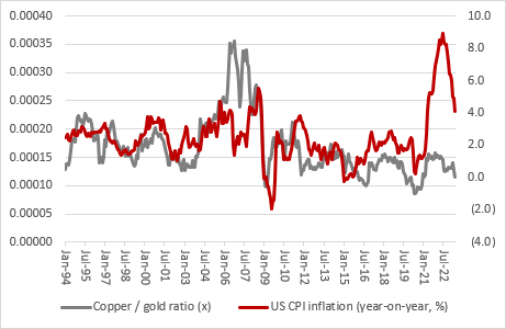
“The past is no guarantee for the future but looking at the copper/gold ratio since 1970, investors could have been forgiven for thinking another inflationary outbreak was on the way, as gold has stoutly outperformed. This may not fit with the decline in the headline US inflation rate, but that is being helped by lower oil and gas prices. Core and service inflation remain sticky, and gold remains alive to this danger.
Source: Refinitiv data
“Gold’s relative strength may also question the orthodox view that America may not suffer any economic landing, let alone a soft or hard one, even if US equity bulls seem keen to price in the Goldilocks scenario of a moderation in inflation, a soft (or even no) landing and a carefully controlled pivot to lower interest rates.
Source: Refinitiv data
“The copper/gold ratio is still 50% above its January 1980 all-time low, so more progress from gold could signal trouble ahead. Someone is going to be wrong and if the equity markets have it right then copper should start to outperform gold pretty smartly, even if it is not doing so right now.

Source: Refinitiv data
“Using the US ten-year Treasury as a proxy, fixed-income markets seem similarly perplexed as to whether the declining copper/gold ratio means inflation and headline interest rates are going to return to their post-1980s downward trend or a 1970s-style upward march.

Source: Refinitiv data
“The stagflationary 1970s look like an outlier on the trend, but that is why its unexpected return would probably be the worst outcome for all for equity and bond holdings.”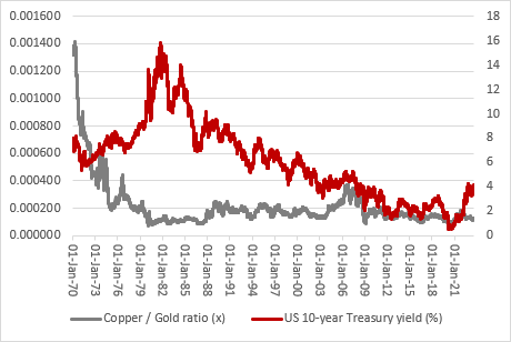
Source: Refinitiv data
These articles are for information purposes only and are not a personal recommendation or advice.
Related content
- Wed, 24/04/2024 - 10:37
- Thu, 18/04/2024 - 12:13
- Thu, 11/04/2024 - 15:01
- Wed, 03/04/2024 - 10:06
- Tue, 26/03/2024 - 16:05